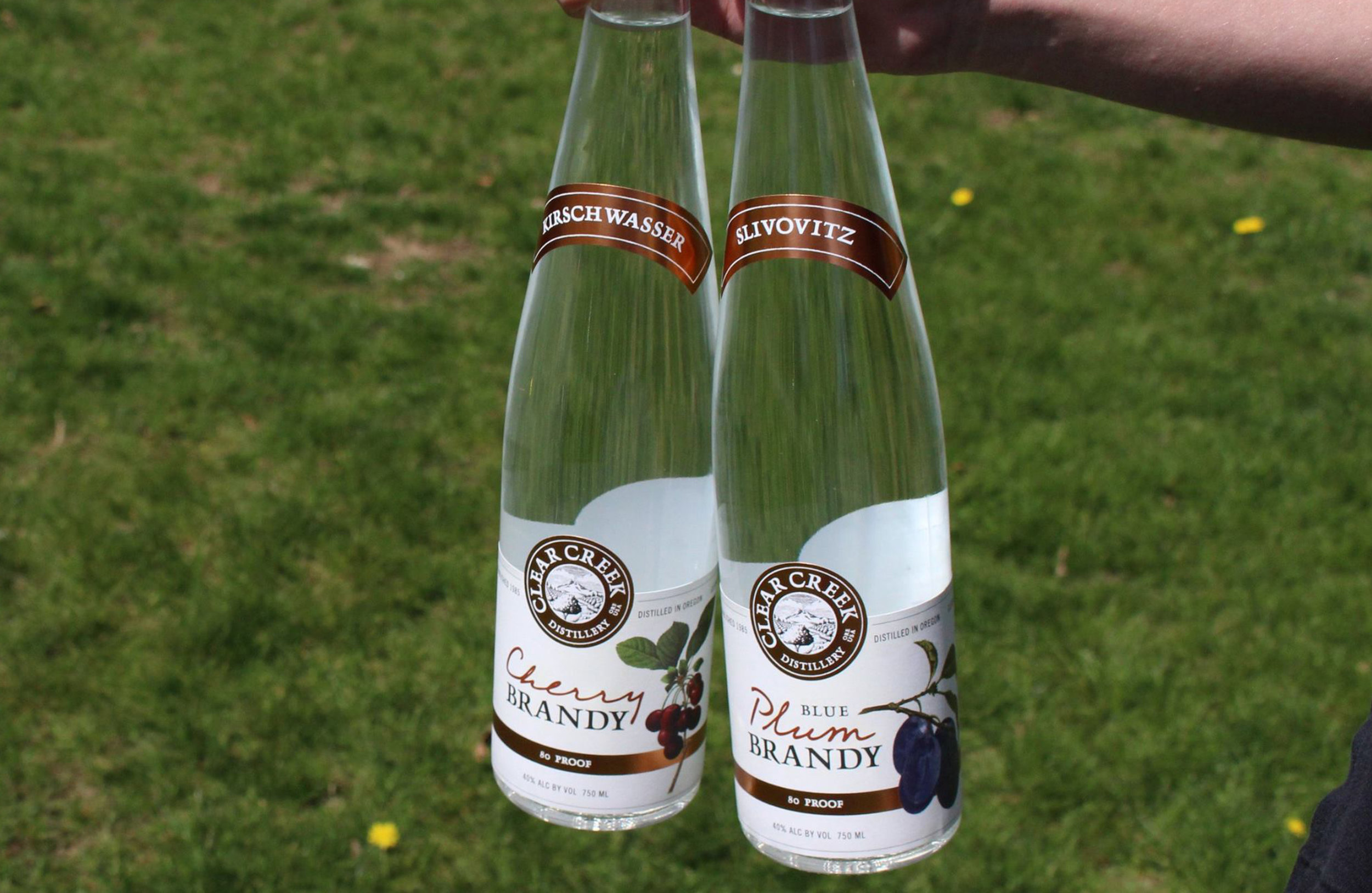
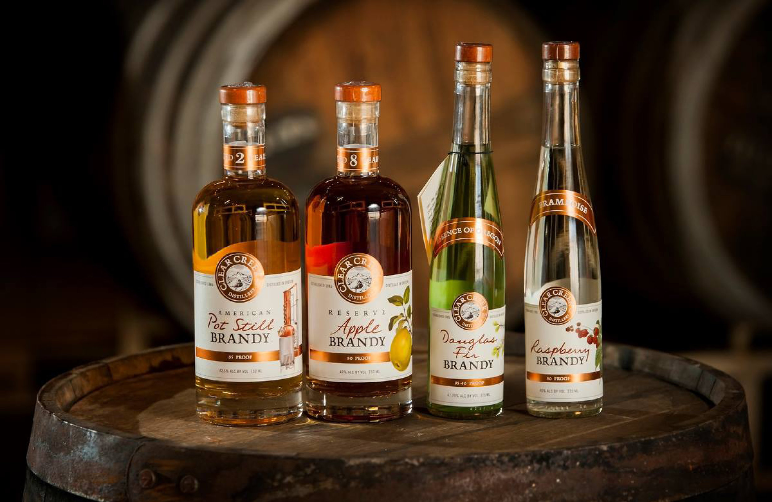
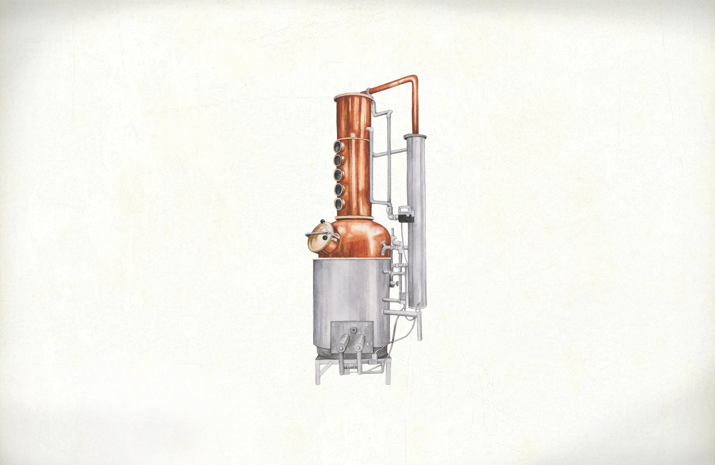
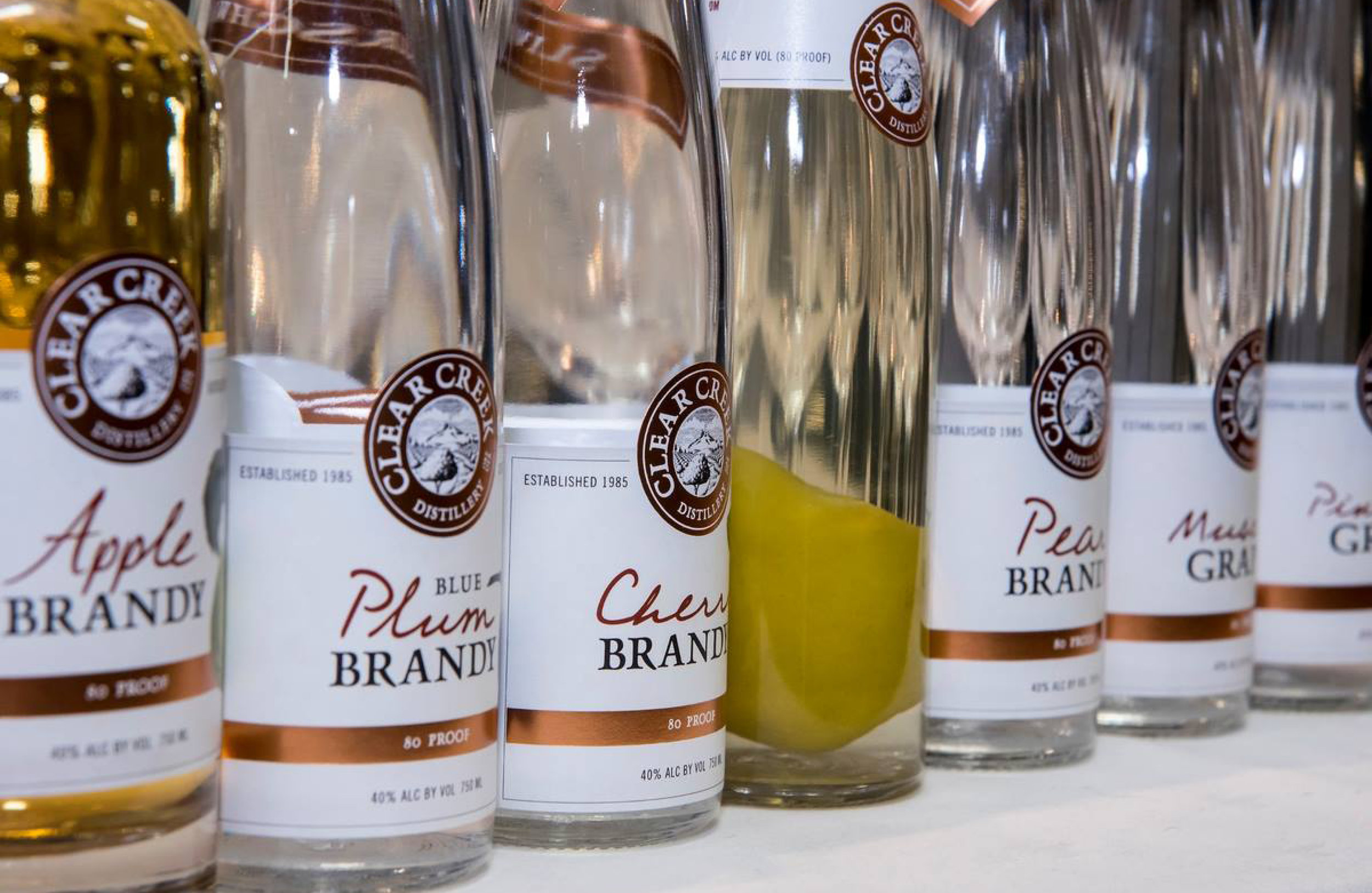
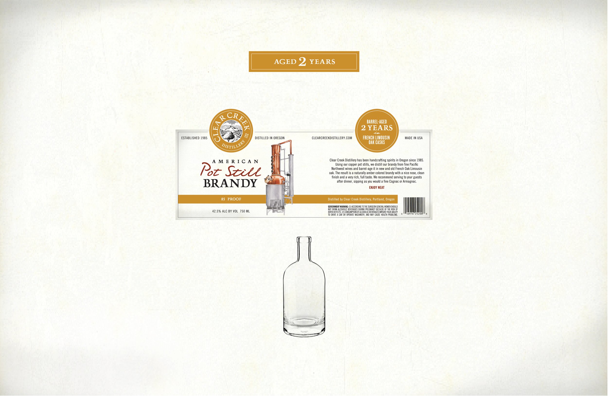
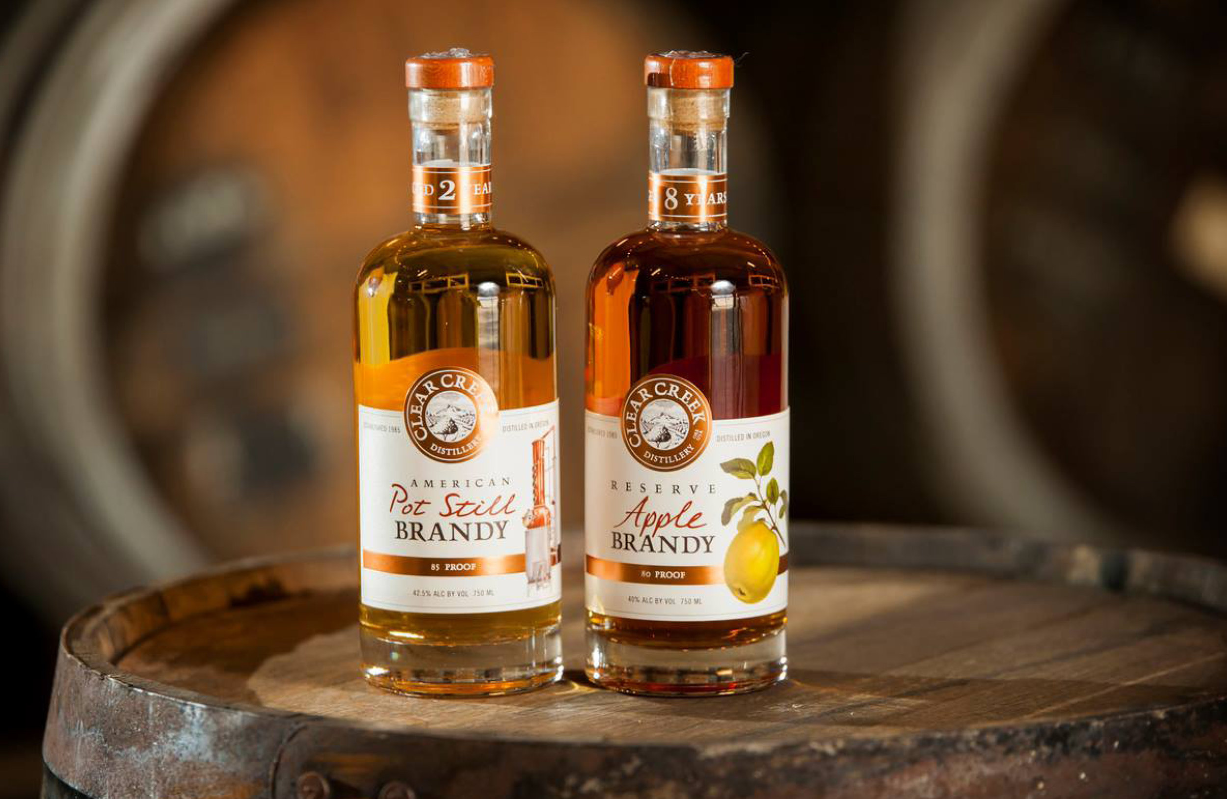
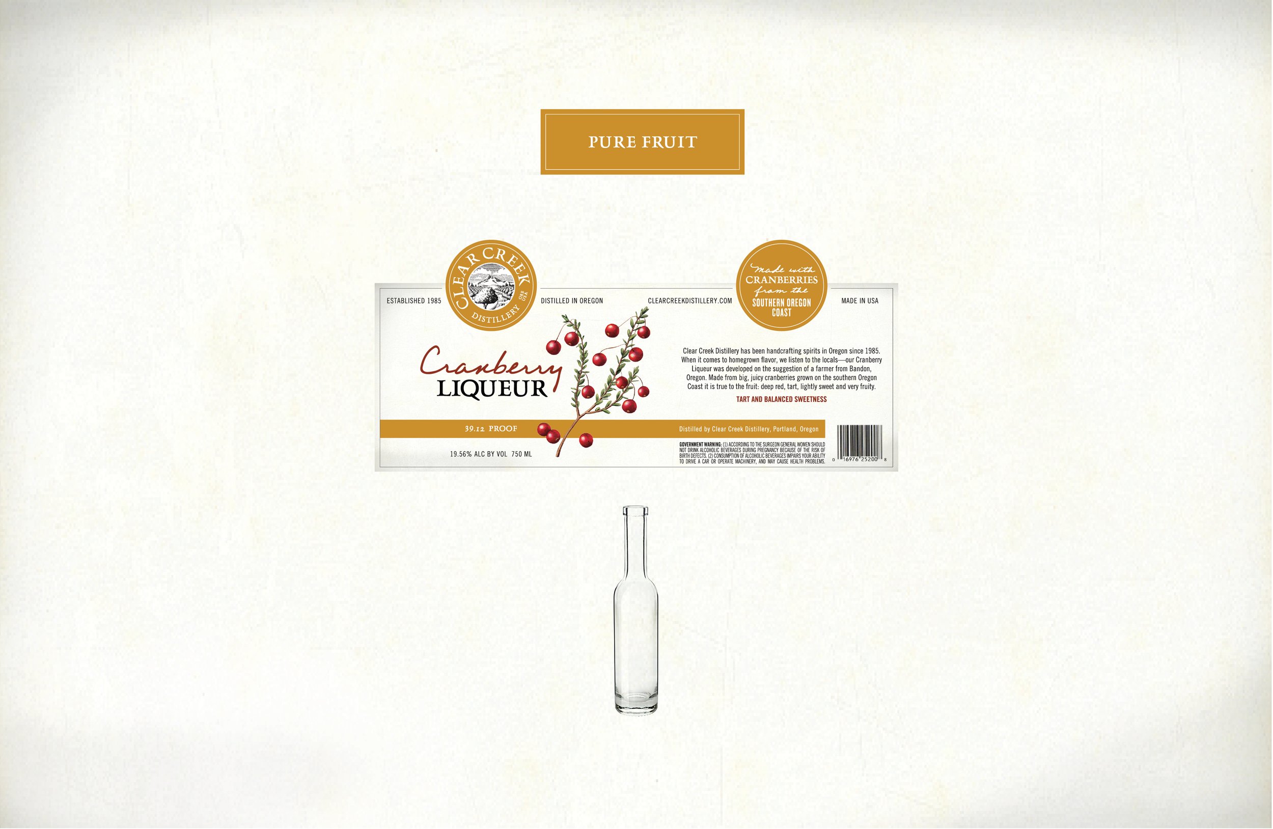
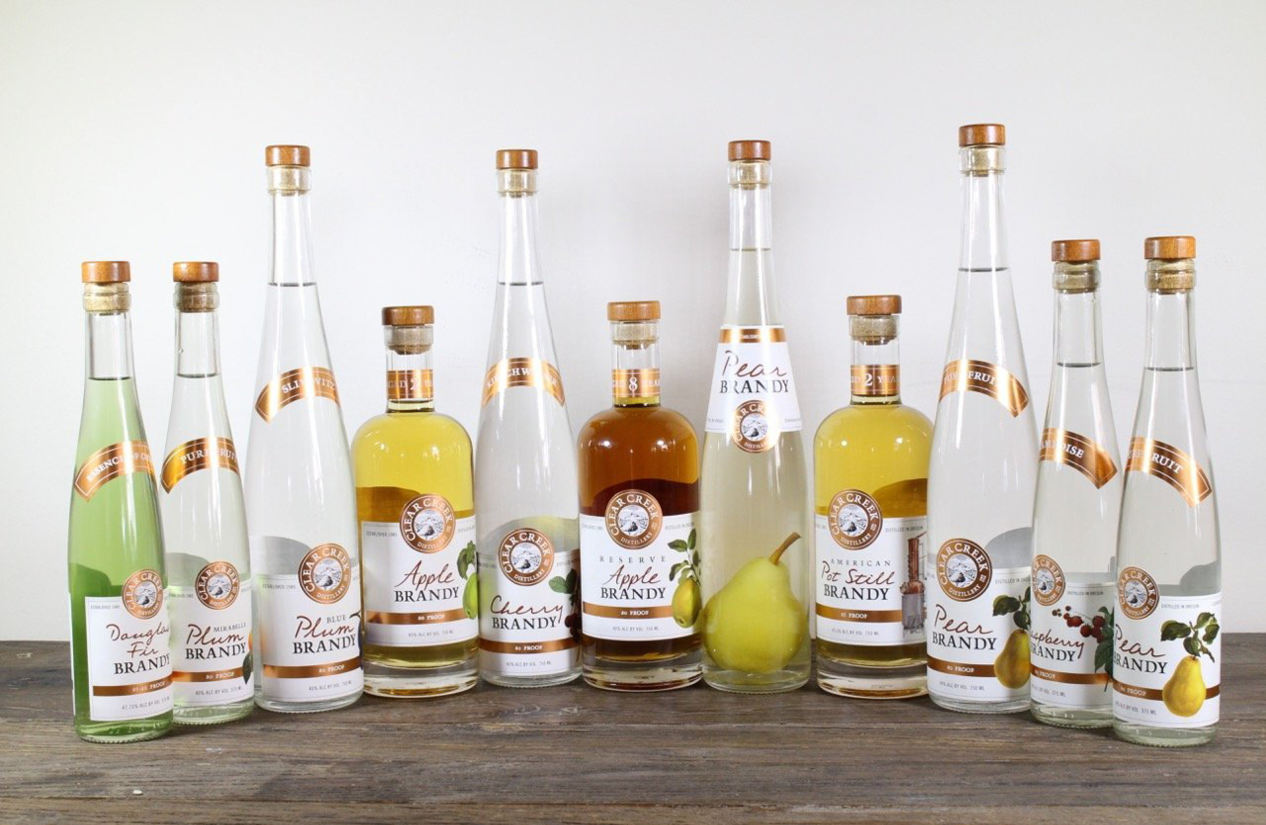
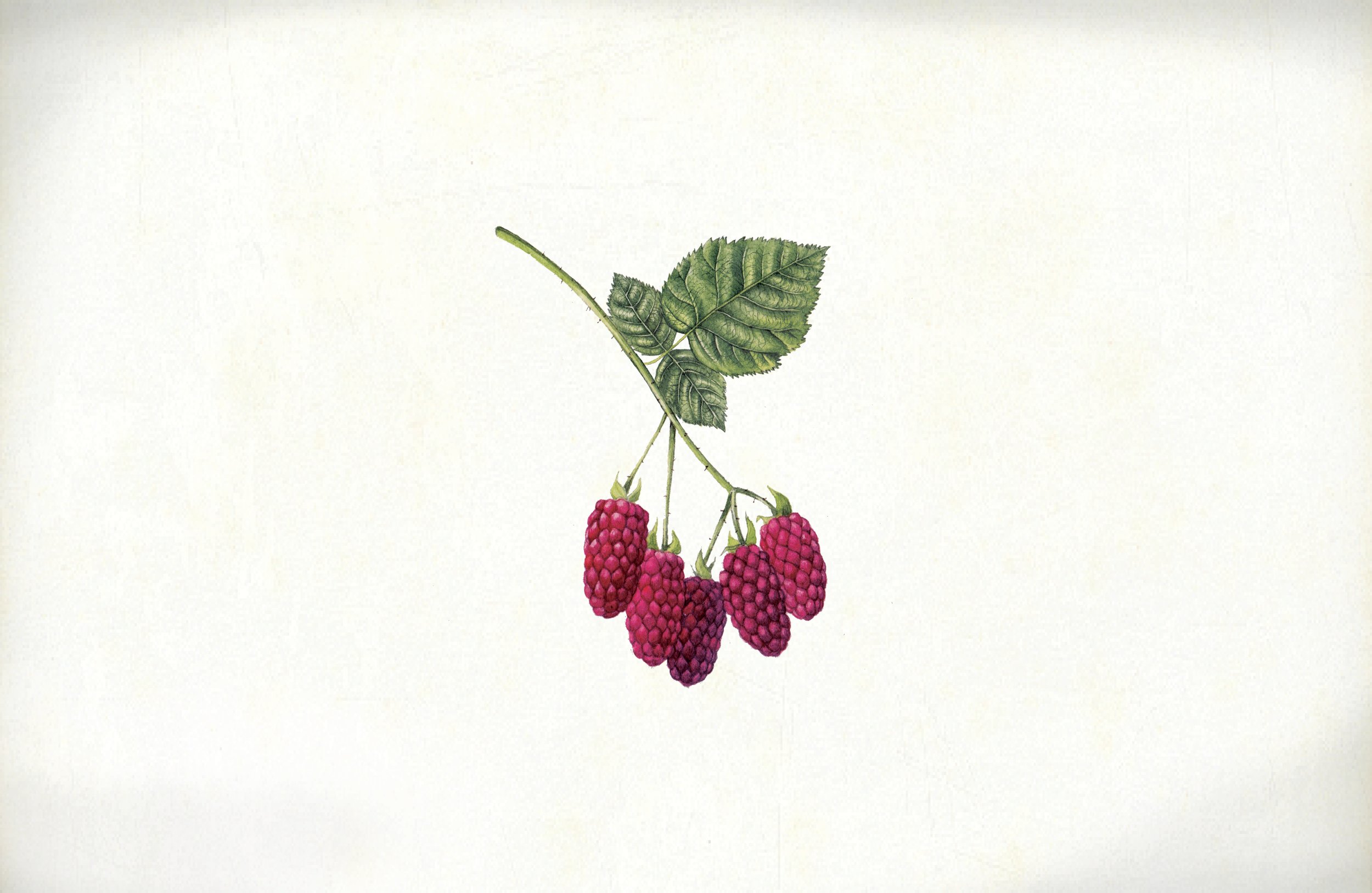
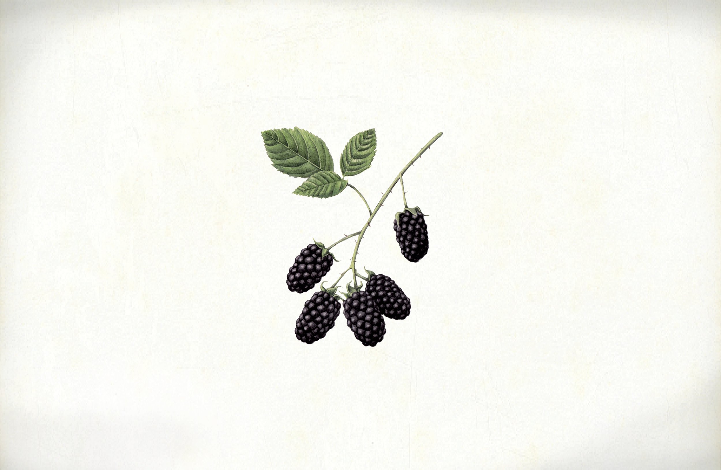
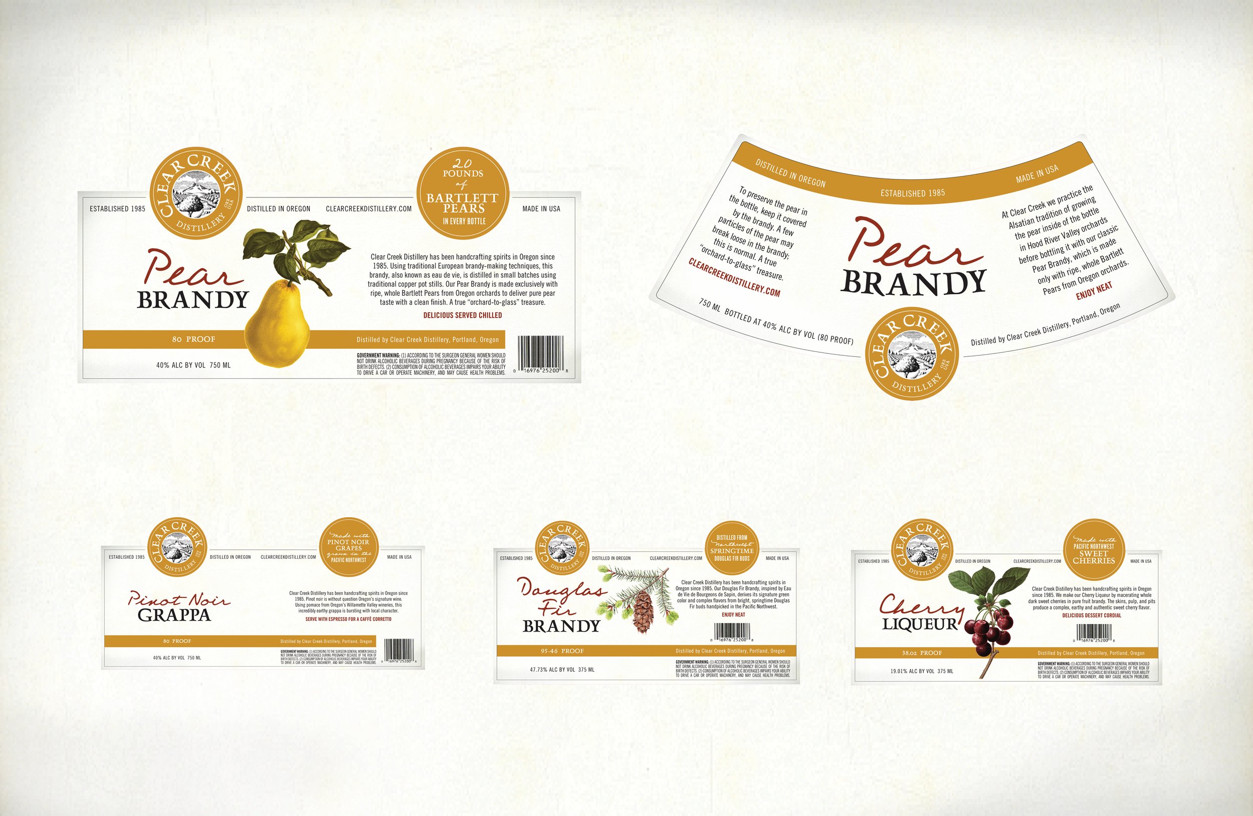
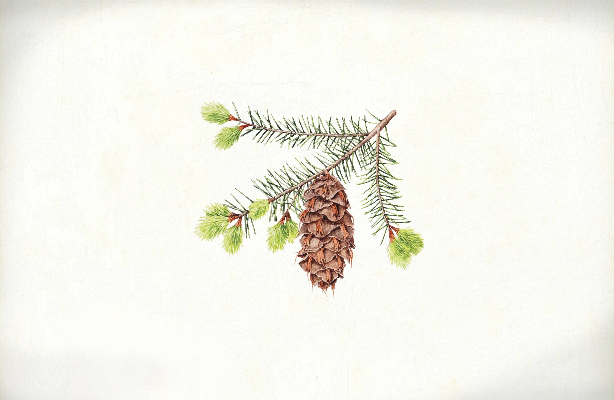
Since 1985, Clear Creek Distillery has been perfecting their old world-styled fruit-based spirits. And while three decades can be a good thing for brandies and whiskies, 30 years can take its toll on a logo. When Opus was given the opportunity to update the branding and packaging of this long-time Portland establishment, we went all in. Featuring lush, locally rendered botanical illustrations and iconic metallic ribboning as a nod to the copper pot distillers, the CCD family of packaging is at once historical and fresh, with a look toward the future.